Maxcakes: A Website to Order Cake from a Bakery.

Role:
UX Designer

Responsibilities:
UX Research, Wireframing, Prototyping, and conducting Usability Studies.

Project duration:
Mar. 2023 - Apr. 2023

The Product

Max cakes bakery is an online cake-ordering shop with locations all around Lagos. They offer the services of taking cake orders of any size, variety, and flavour for all occasions and celebrations.

Their target audience is working adults of the age range between 21-60 who wants to order cakes online and pick-up or have the cake delivered at their preferred location within Lagos and its neighbouring states.

The Problem

Users want to order cakes from the comfort of their homes and have it delivered to them at a preferred location, time and date.

They want to navigate through the website seamlessly with an appeasing site interface.

The Goal

The objective of the product is to create a user-friendly website with an appealing interface and the best possible user experience that solves user problems that users encounter while shopping online.

USER RESEARCH

Summary

I conducted interviews and created empathy maps to understand the users (fictional) I am designing to solve their problems. Through research, I was able to identify a primary user group of people who want to order cake for their celebrations and occasions, without having to visit the bakery before they can place an order for their preferred cake, and still have it delivered to them.

The research confirmed the initial assumption that the users are adults who do not know how to bake or have the time to bake a large cake for an occasion.

Pain Points

1. Users find it difficult to navigate websites as there is poor information architecture on the sites

2. Working adults do not have time to bake large cakes for occasions.

3. Users want the cake to be delivered to their preferred location.

Problem Statement

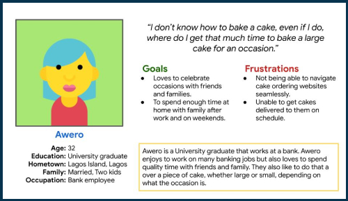
Awero is a bank employee who wants to order cakes online and have it delivered to them while not taking too much time navigating the website so they do not get distracted from their work.

Persona

DESIGN

Sitemap

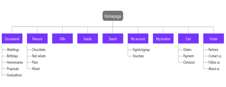
This sitemap was created to enhance website navigation which can be a pain point for some users. With this Information architecture in mind, users can easily navigate through the website with zero-little difficulty.
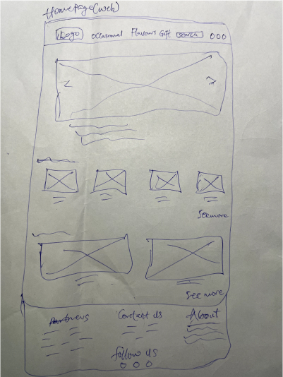
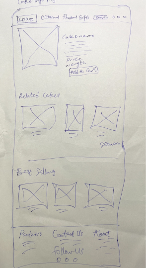
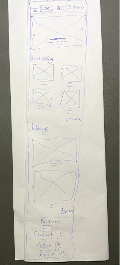
Paper Wireframes

I sketched out the wireframes of each pages on paper, a rough outlook of what my web page would look like. This is the homepage for the website on computer.

Paper Wireframes (Mobile Screen)

Then, I had to sketch for an additional screen size, here being the mobile. As users would like to browse the website on different devices, I also had to design a responsive page for the mobile screen too.

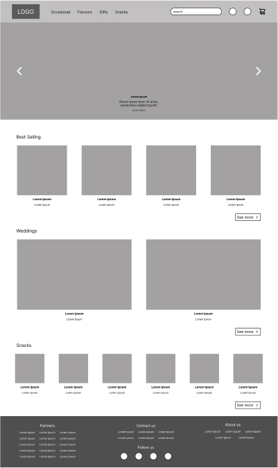
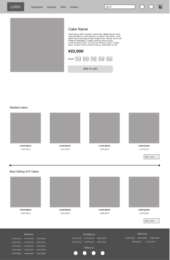
Digital Wireframes

Next, I made a modification of my paper wireframe digitally. Moving from paper to digital wireframes gives a better outlook on the design. Elements of the product are represented with placeholders like shapes and lines.

Digital Wireframes (Mobile Screen)

Due to screen size variation, I created digital wireframes for the mobile pages too.
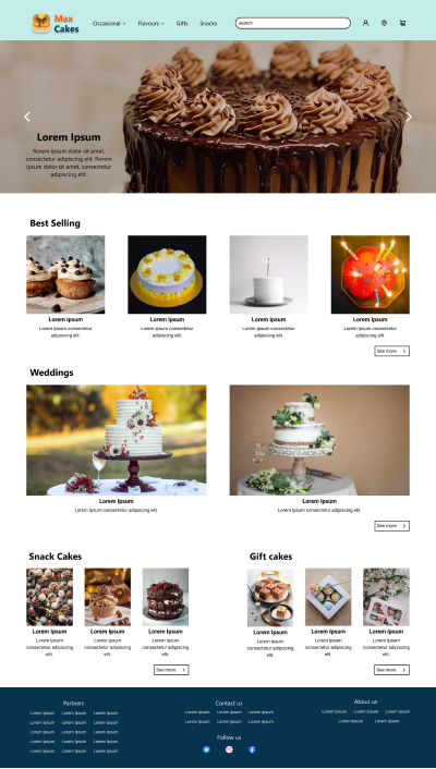
MOCK-UPS

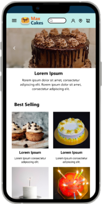
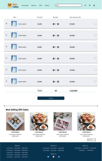
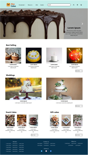
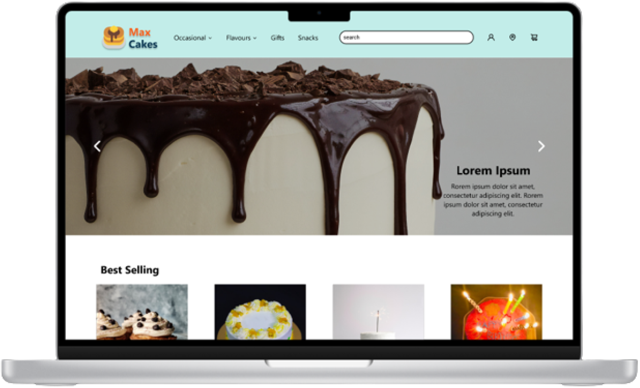
The digital wireframes were modified to create the mock-up pages. This was done by replacing placeholders with icons, images, and colours accordingly.

After creating the mockup pages, a usability study was carried out to check if the product will help users reach their goals, and how easy it will be to reach their goals.

The result of the usability study was used to iterate on the designs of the product to get it closer to the design objective, which is basically meeting users' needs.

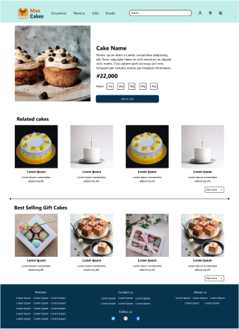
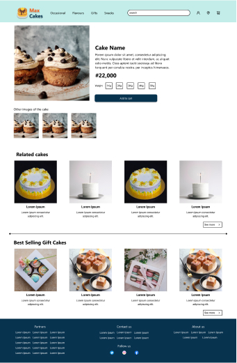
Here, on the cake information page, the usability study shows that users want to see more images of the cake from different angles or images of a different flavour of the same cake. So, I had to iterate and modify the page to meet users' needs.

Before Usability Study

After Usability Study

Mock-Ups (Mobile Screen)

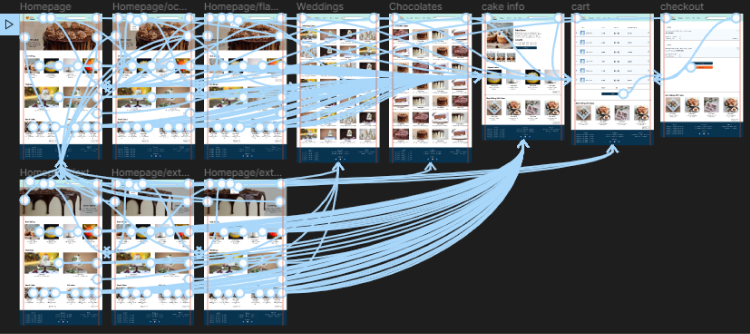
High Fidelity Prototype

https://www.figma.com/proto/vQ6TMUldESFKSl7mQGU5JD/Untitled?page-id=69%3A185&node-id=69-194&viewport=848%2C210%2C0.06&scaling=contain&starting-point-node-id=69%3A194

USABILITY STUDY AND CONCLUSION

Study type - Unmoderated usability study

Location - Lagos, Nigeria.

Participants - 5 participants

Length - 15minutes

Usability Study (findings)

1. Users want to see other images of the cake on the cake details page.

2. Users want to go back to the cart from the checkout page.

3. Users want the option to select the quantity of cake to order.

Accessibility considerations

1. Headings with different-sized texts and weights for clear hierarchical arrangement.

2. Legible typefaces and fonts.

3. Considered accessibility and inclusive design in the use of colour for the website.

Next Steps

1. Conduct follow-up usability studies to know where the website might be lagging or require new updates. This is because the user experience field is dynamic.

2. Improve the website as the bakery grows its brand and business.