Gourmet sandwich is a sandwich shop chain with locations all around Florida. They serve healthy and affordable sandwich variety. Their target audience is occupied people that don’t have time to prepare their meals.
1. Busy people do not always have time to prepare meals.
2. People with visual impairment need apps and websites to support assistive technology like screen readers.
Design an app for Gourmet sandwich that lets users order healthy sandwich for delivery or shop pick-up.
I conducted interviews and created empathy maps to understand the users (fictional) I am designing to solve their problems. Through research, I was able to identify a primary user group of adults who were always busy with work and life hobbies, and did not always have the luxury of time to prepare their meals.
The research confirmed the initial assumption that the users were working adults who did not have time to cook. Also, research revealed that time was not the only factor that would stop them from cooking, other factors include dedication to their work, time and the stress of grocery shopping.
1. Working adults do not have time to prepare their meals.
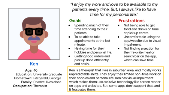
2. Uncomfortable using the app/website due to visual impairment.
3. Not finding a section for their favourite meal or search bar on the app, which can save time.
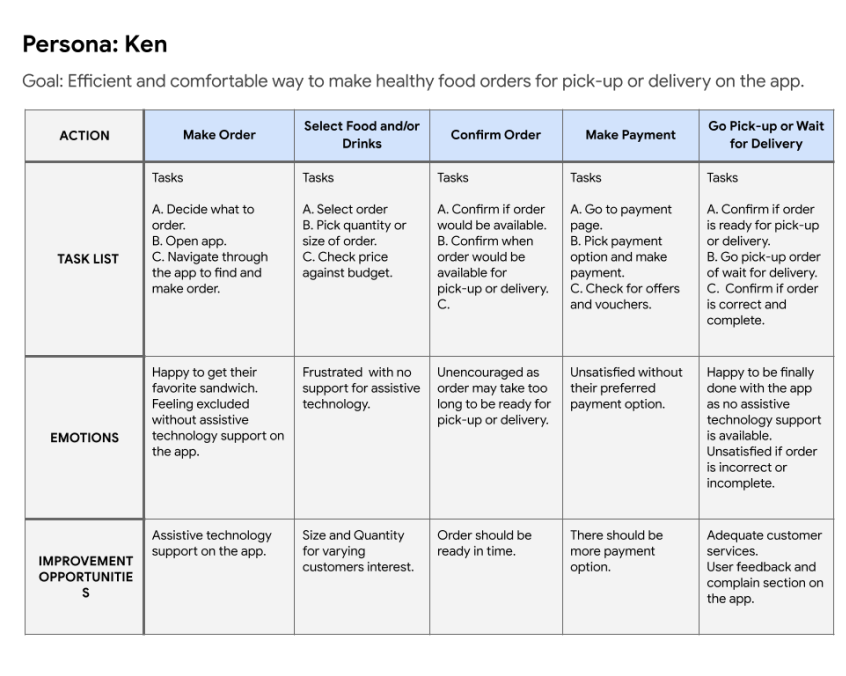
Ken is a busy therapist with a tight schedule who needs support for assistive technology on the gourmet sandwich app because they are visually impaired.
This Ken’s User Journey Map reveals how helpful it will be for users to have a dedicated app for ordering meals from gourmet sandwich shop.
My goal is to make the pages easily accessible to users with visual impairment. So, the pages are screen reader friendly, as they are not text heavy and direct to navigate through the user flow.
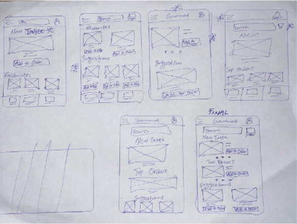
The design of the page is to make it easy for users to switch through navigation, where the pages are of no heavy text.
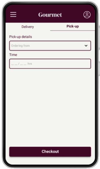
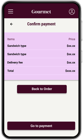
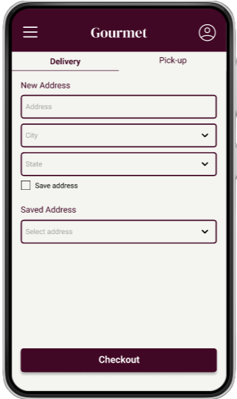
The screens are designed with less text and easy to add a menu to their order.
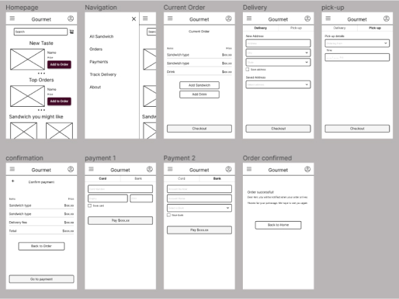
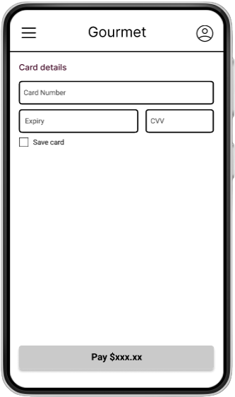
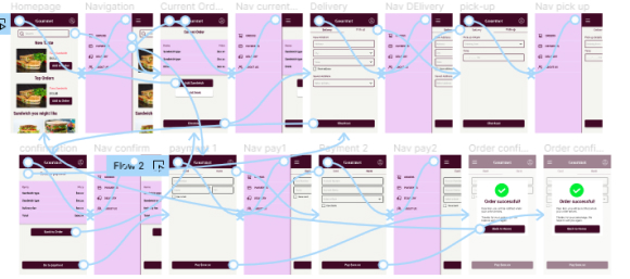
The low fidelity prototype showed the primary user flow that was used to conduct the first round of usability test.
https://www.figma.com/file/SrMCcaSPYDIPe7AiZrxnRq/Portfolio-proect?node-id=226%3A200&t=u0o3DsiwaDCcIznA-1Two rounds of usability studies were conducted. The first round guided the design from wireframes to mock-up, while the second round defined what aspect of the product needed to be modified.
1. Users want to make orders quickly.
2. Users want many payment options.
3. Users are comfortable using the app.
1. Users want to return to the homepage from any page of the app.
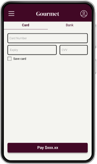
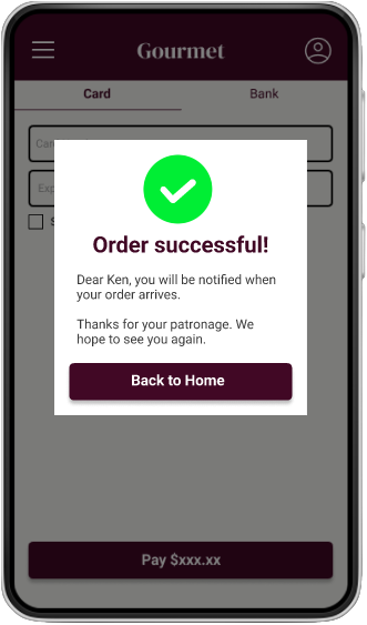
After the first round of usability study, it was revealed that users want more payment option. So, in the mock-up, the option of bank payment was included.
The second usability study revealed that users want to return to the homepage from any page of the app. So, iteration was done and the app was designed to return to the homepage from any page of the app by tapping on the gourmet text in the top bar.
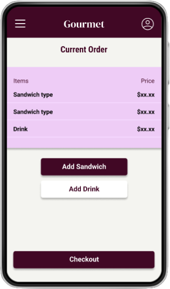
The high-fidelity prototype was used to conduct the second usability study, after which iteration was done to make the app meet users’ need of wanting to return to the homepage from any page of the app.
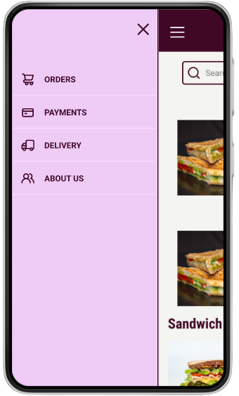
https://www.figma.com/file/SrMCcaSPYDIPe7AiZrxnRq/Portfolio-proect?node-id=205%3A261&t=OQN4RKEjywZtgDc5-11. Icons were used to make navigation through the app easier.
2. The app supports screen-reader and is not text-heavy for the benefit of users with visual impairment.
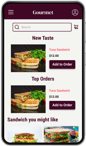
3. The imagery used was a good description of the menu, which helps users better understand the design and the food they wish to order.
The app makes it easier for users to meet their needs of ordering food quickly and interacting with the app comfortably.
While designing the app, I learned that usability study is one of the most important process in designing a product. It helps greatly to avoid or take out designer’s bias that might have taken place while designing.
1. Conduct another round of usability to know if users are contented with the payment options available or if they need more to meet their pain point about making payment.
2. Conduct more user research to know where the app needs improvement.